UI Design for a Data-Dense Planning Platform
Context
PerfectPlanner is a data-heavy planning and operations tool used to manage complex workflows, priorities, and resource decisions. The product already existed in a functional form, but the interface had become dated, visually inconsistent, and difficult to scan efficiently.
The goal of this project was to modernise the UI, improve clarity and hierarchy across dense screens, and translate existing product logic into high-fidelity, implementation-ready designs without disrupting established workflows.
Starting Point and Constraints
The existing product posed several challenges:
- Screens were dense and unaligned, making quick scanning difficult
- Visual hierarchy was inconsistent across modules
- Controls, tables, and states lacked a unified system
- The product had to remain familiar to existing users
Key constraints:
- Core workflows and data structures were fixed
- Designs had to be engineering-feasible, not conceptual
- Improvements needed to be incremental, not disruptive
Design Approach
My approach centred on clarity, consistency, and decision speed:
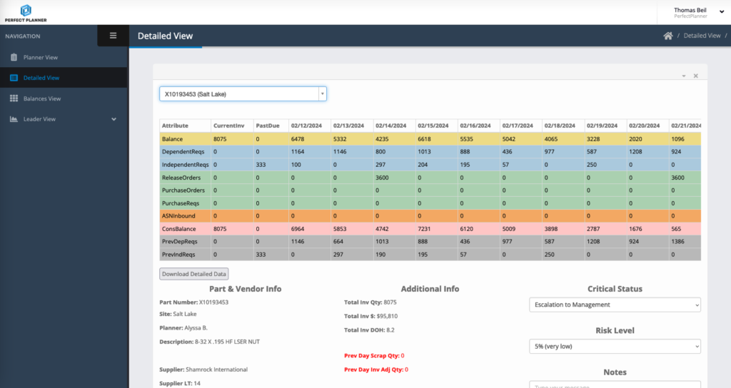
- Translating low-fidelity wireframes into clean, structured layouts
- Establishing a clear visual hierarchy for data-heavy tables and controls
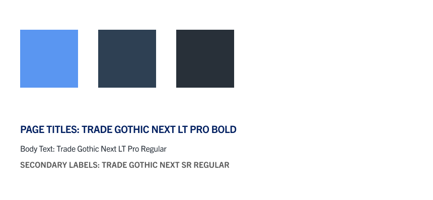
- Standardising components (tables, filters, buttons, states)
- Designing explicit interaction and system states (hover, selected, disabled, empty)
- Ensuring every screen was ready for direct developer handoff
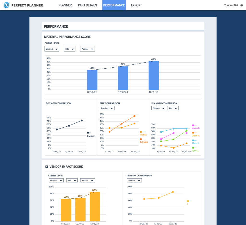
Rather than adding decoration, the work focused on reducing cognitive load and making complex information easier to scan and act on.
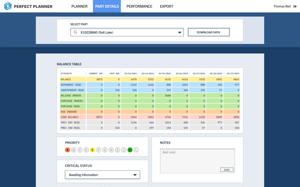
Design Highlights
- Strong row and column hierarchy for readability
- Clear affordances for sorting, filtering, and selection
- Visual distinction between interactive and static data
The result is a table system that supports faster interpretation and fewer errors.
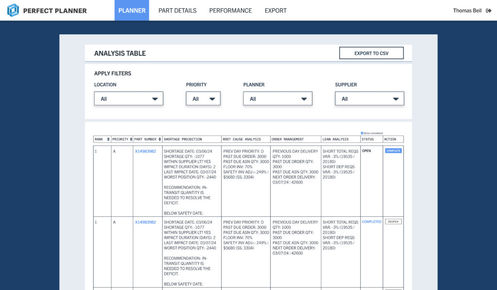
This reduced visual noise while preserving information density.
Outcome
The redesigned UI brought structure and consistency to a product that was already functionally strong but visually fragmented. By clarifying hierarchy, spacing, and interaction patterns, the interface became easier to scan and reason about across dense planning and review workflows.
From a delivery standpoint, the work resulted in high-fidelity, implementation-ready designs that engineering could build from directly, reducing ambiguity and rework. Shared components and defined states helped align previously inconsistent screens into a cohesive system.
The redesign improved day-to-day usability without changing core workflows, allowing existing users to transition smoothly while making the product feel more deliberate, modern, and prepared for future expansion.